What does climate look like? How do people envision climate as a process? How can we better “visualize” real mechanisms that make up climate?
As we think about these questions, we must first touch on what we mean when we say “climate”. We certainly do not mean “weather” in the immediate sense, however in the end it is the aggregate of weather that ultimately makes up a local climate.
Generally speaking, “climate” is a conditional state experienced by a given landscape as the result of long-term (interacting) trends in atmospheric conditions such as air temperature, relative humidity, incident solar radiation, precipitation, wind, and so forth. A “climate” can possess a fairly wide range of conditions that fluctuate on different timescales, from daily to seasonally to decadally and longer. Not all climates are created equal, take for example the month-to-month consistency of conditions at your favorite (or wishful) tropical vacation getaway, and compare it to the harsh annual variability of, say, interior Alaska.

We tend to think of the “climate” of a place to be something that shouldn’t change much, if at all. Humans don’t like surprises, unless perhaps it’s an unexpected tax-free lottery win. In the natural system, it turns out that climate changes all the time. It is simply a matter of defining the geographic and time scales. When we examine vegetation distributions (excellent indicators of medium-term “climate” envelopes), most populations have noticeable dynamic activity along the geographical edges. According to biogeographical theory, this is actually expected. Very often the ultimate driver of these dynamics (expansion, contraction, competition, etc) is in fact the continuum of climate. If measured in the short term, this effect is termed “dynamic equilibrium”, but if one were observe long enough (or assemble evidence of past conditions), we would discover shift in some geographical dimension (north, south, upslope, across valley, etc).
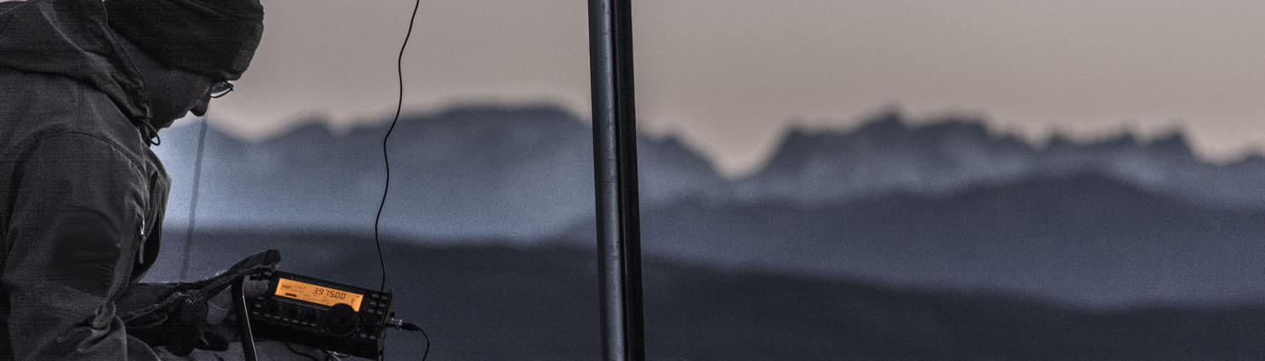
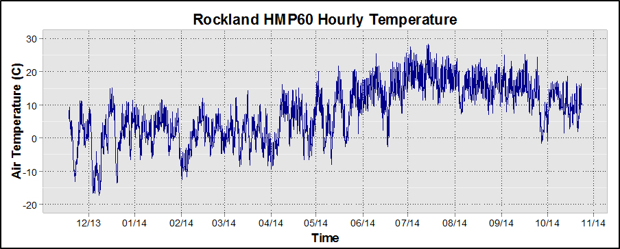
Given our short life spans and painfully selective memories, humans have a difficult time visualizing the patterns of weather activity that ultimately lead to shifts in the long-term “average” or envelope of persistent conditions. This is especially true in regions of greater inter-annual variability, where each year is somewhat different than the one before in terms of the traditional “climate” mechanisms. In today’s tech-filled world, we have access to increasingly better data from increasingly more places. Some of these data lend themselves better to rapid assessment and visualization than others. For instance, I could show a graph of air temperature for a year from a weather station, and that would be neat and all, but it wouldn’t give quite the same sense of what actually happened onsite over the course of a year as, say, a moving picture.
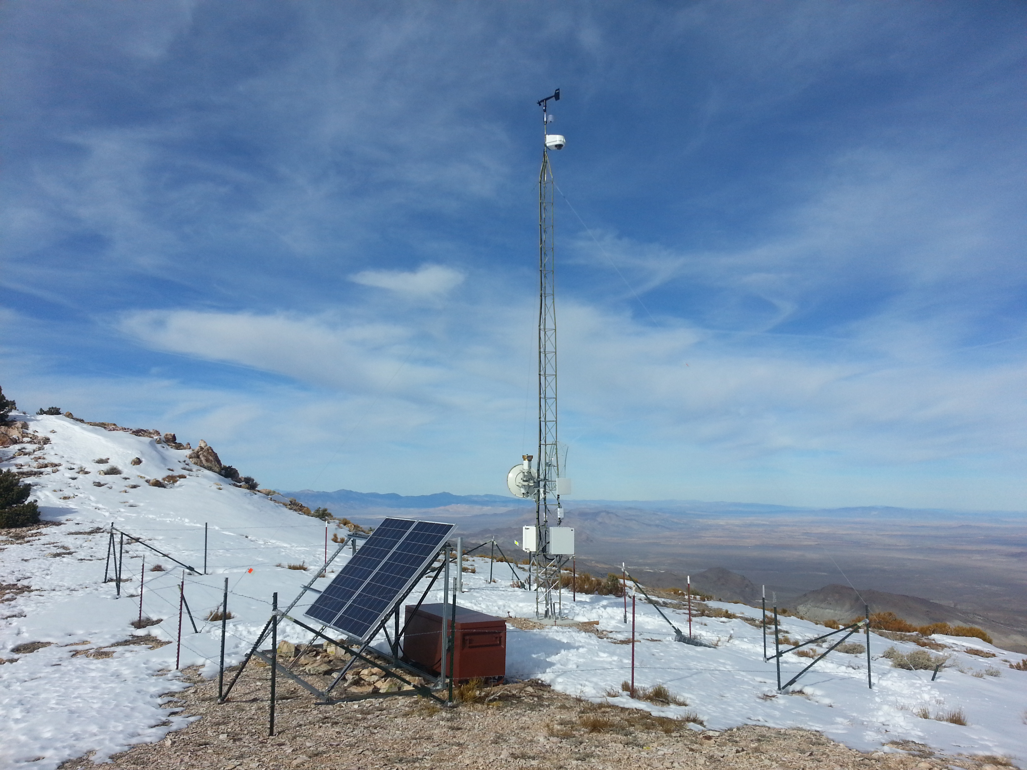
If a picture is worth a thousand words, then an animation must be worth quite a few sterile data points. Using automated image capture of the sky/atmospheric conditions at the same station, we get to see the entire year of weather in a few minutes. It doesn’t have quite the same type of quantitative comparability that a time series of numbers does, but it gets a completely different point across. Looking at the video at the start of this post, we see that the interior of the entire Walker Basin watershed actually received quite a few cloudy days and summertime precipitation events. We can also see how long snow lingered on various topographic aspects, and at which elevations. In the case of this camera, several other tree-ring study sites around the watershed are in view and daily conditions at their locations can also be qualitatively assessed. To obtain these same data using distributed sensors would be very costly, and satellite (remote) sensing of this type of information is not yet available.
More importantly, a visualization like this immediately raises additional scientific questions that would not necessarily come from a graph of raw temperature data. Given the serious drought conditions in the Walker Basin in 2013 due mostly to absence of winter snowpack, would the substantial cloudiness and frequent summer storms have had a positive effect on soil moisture retention (less potential evapotranspiration?) and buffered the effects of the winter drought on the various ecological communities in the Basin? How would these processes show up in records of tree growth? These questions of course lead down quite the scientific rabbit hole, and yet are crucial to improving interpretation of the prevailing and reconstructed climate and what some of the causes or mitigating weather factors could be.
Do you find organized time-lapse imagery useful or intriguing? What stands out for you in the video? Leave a comment or Tweet your finding!